The Lagunitas brewing company
Upon recommendation of the Art Director position at Lagunitas, I was confident in possibly becoming an aid in the search for a conceptual-thinking creative. For consideration and to display my skillsets, I’ve included the ideation process and execution of 4 new brands under the Lagunitas moniker.
For this project I wanted to show a variety of executions:
1. A very true to brand concept
2. Pushing the brand a little bit beyond it’s comfort zone.
3. A THC/DMT/Hemp infused product (due to the now state-legalization of THC infused products)
4. A far-stretch for the brand.
From there, I wanted to show my conceptualization, from idea to illustration to branding/ packaging to social media/ marketing. Additionally, I have created a social media / marketing campaign for one of beers.

1. Lagunitas “Who’s a Good Boy” Summer Ale
A very traditional, true-to-brand beer for a possible limited release. As Lagunitas’ brand loves Man’s Best Friend, it seemed like the best pairing for a good time spent during the summer season.
For this first brand, I studied the consistency of current and present Lagunitas beer labels. I found common themes within the brands, such as the use of several typefaces, used and rotated throughout. I also noticed how some were intentionally paired to represent either elegance or intensity, depending on their flavors, availability, and alcohol content. I repurposed these subtle nuances into the creation of the “Who’s a Good Boy Summer Ale” logo. I chose to use a lighter red to reflect the summer’s positive warmth, as well as the ale’s color. I used a lighter blue for the border, referencing the blue sky and bodies of water that are commonly associated with summer activities. I incorporated the Lagunitas dog cresting over the logo’s word mark, as if he was he was poking his head in response to the question of the beer’s name.


MARKETING CAMPAIGN
This execution was made to highlight the “Who’s a Good Boy” Summer Ale brand. Using my skills in photography, illustration, digital editing, and graphic design, I was able to develop a mock campaign creating billboards, posters, and social media deliverables.
By using the hashtag #thegoodboysofsummer, we’re invoking the subconscious memory of a tune we’ve heard a million of times with the love of our pets, inspiring more followers to post pictures of themselves with a “Who’s a Good Boy” Summer Ale and their favorite four-legged friends.


2. Lagunitas “Ay Mami” Cayenne Chocolate Imperial Stout
Pushing the brand a bit, I wanted to introduce a one-hitter series beer that takes back this “derogatory” term Ay Mami and show off an illustrated powerful female Latina figure. Strong, sexy, and not afraid to sock you in the mouth, just like this spicy chocolate stout beer. Pushing further, using a washed water color illustration, I sketched a modern pin up girl in a Rosie the Riveter outfit. This was done as something to be more refined with clean lines, yet still keeping close to the Lagunitas brand.
For “Ay Mami,” I referenced the Lagunitas Lil Sumpin’ character to introduce another female character within the brand. I researched images of classic American traditional tattoo pin ups and wanted to use a character that was strong and independent in contrast to being overly sexualized. I also wanted her to be of Hispanic origin to pay homage to the heavily Hispanic communities in both Petaluma, California and Chicago, Illinois.
I used references photos of a dear friend of mine for the likeness of the female illustration. She is a strong, independent single mother, unafraid to stand up and speak her mind, a quality that is important light of the modern social and equality movements. This strength reflects the beer’s sweet, burning flavor. Parallel to character, they’re beautiful, but if you take I disrespect either, you might get burnt.


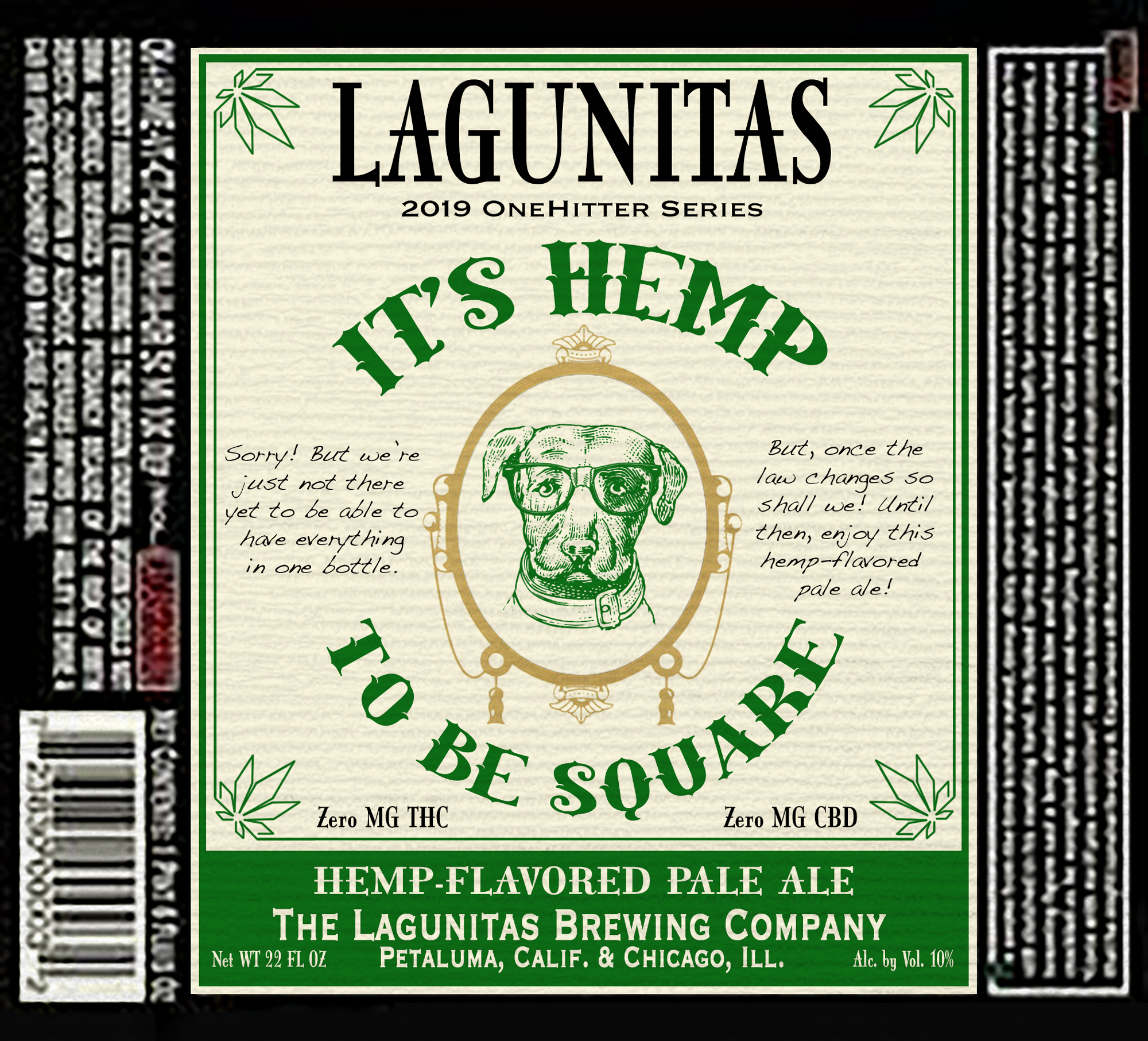
3. Lagunitas “It’s Hemp to be Square” Hemp-Infused Pale Ale
This Hemp-infused flavor, derived from hemp terpenes, was not my first idea. Ideally, I set out to mock up a logo for a THC-infused brew. While designing this label, I realized there must be some safety regulations (via California law) I would need to incorporate onto my bottle. I then discovered, unfortunately, California alcohol and THC laws do not allow for both alcohol and THC being together in a product. This restriction forced me to either put together a fictional beer or pivot and rebrand to become a more realistic, legal hemp-infused beer derived from the plant’s terpenes. Thus, it’s hemp to be square. This label gives a nod to Dr. Dre’s famous albums cover art “The Chronic” as well as Zig Zag Papers. “It’s Hemp to be Square” is not only a play on words, but also a reference to the fact that although we can’t have both of our favorite things in one bottle, at least we can give you the taste and flavor of hemp with your alcoholic beverage.
For the Hemp-infused beer, I wanted to incorporate marijuana culture into the design. I took inspiration from Dr. Dre’s album, “The Chronic,” which had originally used the branding of Zig Zag Papers, a commonly preferred product for smoking pot. The use of this existing brand with the name, “It’s Hemp to be Square,” paints the narrative of the dorkiness of an individual who claims they are “down with pot and rap culture” by saying, “Yeah, I listened to The Chronic. I’m hip, I know all about pot yo!”
The branding is pushed a tad by introducing a marijuana leaf filigree to the consistently used double border on Lagunitas’ glass bottle labels. I wanted it to be shown that this beer is intended to have strongly incorporated flavors derived from the terpenes of the hemp plant. The use of green and gold also allude to a richness of flavor that will be experienced while enjoying.


4. Lagunitas “Dunkle Hund” Bavarian Lager
I noticed Lagunitas has moved to putting their beer in cans with a change to the design in the branding execution. The cans are more colorful, a fully encompassing cleaned-label in contrast to the standard corrugated paper bottle labels, complete with several typefaces and slapped sticker images. I wanted to push this a little further and put together something more off-brand to market an Oktoberfest inspired Dunkle Bavarian Ale. On this can, the concept uses richer, darker colors, nodding to the rich, dark, malty flavors of the beer inside. It also features a vector-rendered, large, hulking stoic dog with a dark coat in contrast to the line art/cross hatched dog icon, as well as the traditional music diamond checkered pattern of Munich. Additionally, it incorporates a dark forest graphic, in reference to the Black Forest in Germany. I wanted to feature it in a 22 ounce can to reference back to the large glass steins one would usually handle during this German harvest festival.
For Lagunitas Dunkle Hund, I pushed into an alternative style of branding to show my versatility and willingness to be able to experiment and explore different possibilities for the Lagunitas brand. While researching the brewery, I discovered Lagunitas had begun to package their beer in cans. The branding of the cans was a stark difference to that of their normal bottle container. The 12 of Never Ale and Sumpin’ Easy can were bright and vibrant, compared to the desaturated earth tones on paper. I saw this as a perfect opportunity to try a similar style, yet continuing to push the boundaries of the brand.
I decided to go with one a personal favorite beer, the Dark Bavarian Lager: Dunkle. I decided to subtly brand it as an Oktoberfest style beer, using the famous checkered blue-and-white diamond pattern used by the city of Munich, Germany. I used a blue overlay on the pattern to help avoid the design from being too busy. The dark blue overlay is a reference to the dark German night in the later months of the year. The trees that divide the checker board from the top of the can are a nod to Germany’s famous Black Forest. I used a German style calligraphy, as it worked nicely with Lagunitas’ primary font, Druk Bold, as well as the checkered background. Finally, to continue with this theme I introduced a the image of a Cane Corso. Just like this beer, it is strong, large, and dark, yet he has a gentleness to his eyes.


