Crossfit
Oakland Park
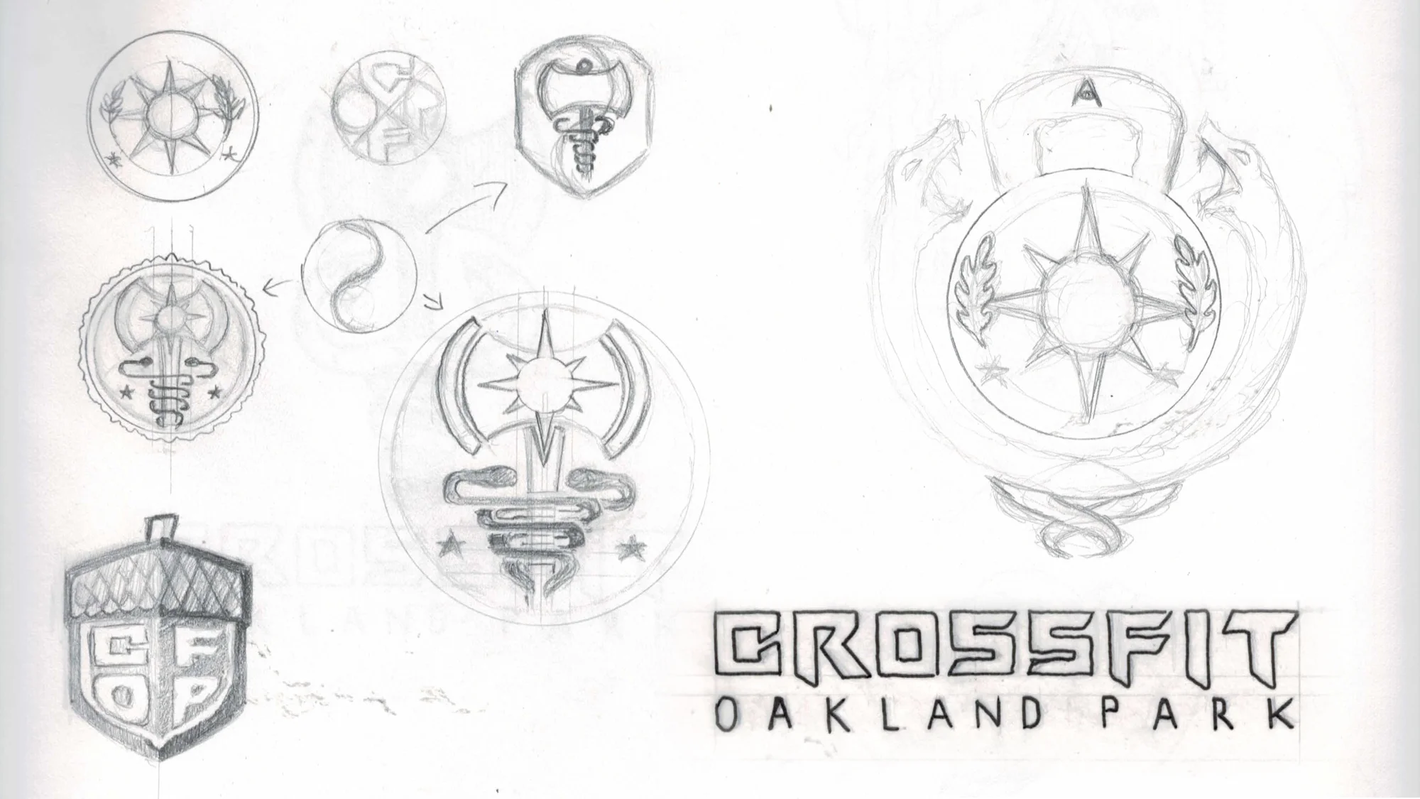
Collaborating closely with the owner, I played a key role in developing the branding and designing the logo for one of South Florida’s most successful CrossFit gyms. The visual identity was carefully crafted to reflect the gym's core values of strength, community, and performance, while also incorporating deeper themes of healing and resilience. The logo thoughtfully integrates the caduceus symbol, representing healing and the restorative power of fitness. Additionally, the design pays tribute to the owner's military background, specifically his service in the 29th Infantry Division of the United States Army. This connection to the military is subtly woven into the brand, symbolizing discipline, perseverance, and the spirit of overcoming challenges. The result is a logo that not only resonates with the gym’s audience but also tells a powerful story of strength, healing, and honor.


inspiration
Logo Design


Branding

Hand Painted Gym Wall Mural


Athletic Apparel

Direct Mailer

