Asian
Fusion
with a retro twist
In late 2020, as the world began to emerge from quarantine, life was starting to return to some sense of normalcy. During this time, a former classmate of mine, now a chef, reached out with an exciting new business venture: a food truck in North Carolina offering Vietnamese-inspired Asian fusion cuisine. He was seeking my expertise to design a logo that would reflect the essence of his culinary vision.
What began as a logo design quickly evolved into a full-scale branding project. After a few discussions, we decided to not only create a striking logo but also develop the entire brand identity, with a particular focus on an eye-catching vehicle wrap for the food truck that would make a bold statement on the road.
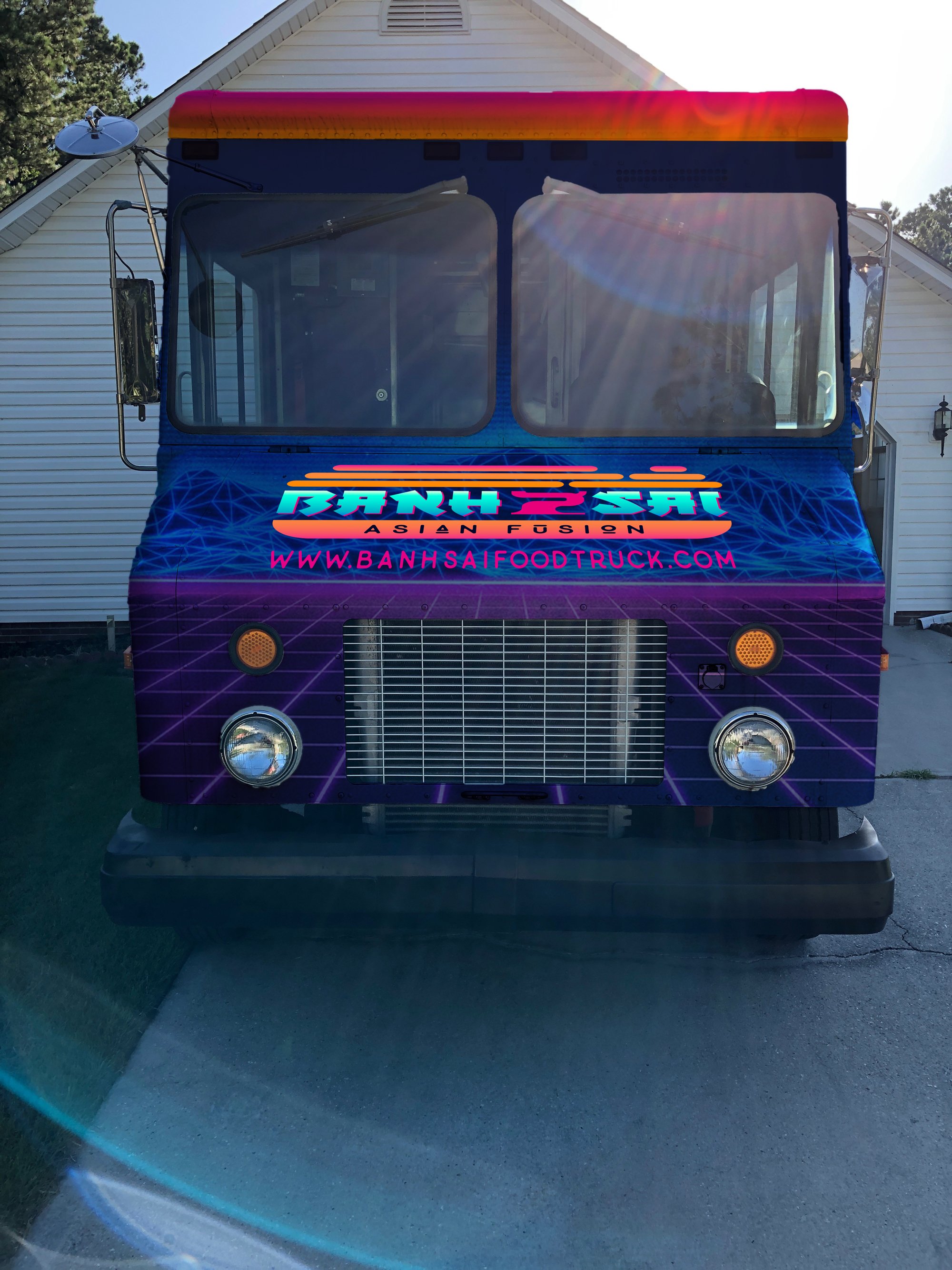
In close collaboration, the owner and I landed on the name Banh Sai Asian Fusion, which perfectly captured the fusion of cultures in the food offerings. The brand’s aesthetic was inspired by a cyberpunk theme, drawing from the vibrant neon lights and gritty urban landscapes of major Asian cities like Ho Chi Minh City (Saigon), Osaka, Tokyo, Hong Kong, Shanghai, Seoul, and Singapore. This design direction not only honored the cultural roots of the cuisine but also celebrated the dynamic, futuristic energy of 80s pop culture.
Primary and Alternate
Logo Designs
When developing the logo for Banh Sai, I was immediately drawn to the symbolism of a Bonsai Tree, which conveys a sense of balance and growth, combined with the iconic Vietnamese Banh Mi sandwich—a nod to the restaurant’s culinary theme. The goal was to craft a logo that not only represented the fusion of cultures but also embodied the vibrant, futuristic energy of the brand’s 80s cyberpunk theme.
To bring this vision to life, I chose a color palette inspired by day-glow hues, echoing the vivid neon lights characteristic of cyberpunk aesthetics. These bright, glowing colors capture the essence of a bustling, high-energy cityscape, bringing the logo to life like a neon sign in the night.
The wordmark was carefully selected to evoke a modern Asian feel without leaning too heavily into any specific alphabet, ensuring the typeface was distinctive and readable. The layout of the logo itself is horizontally oriented, designed to mimic the shape of a Banh Mi sandwich. The wordmark serves as the "meat" between two "buns," with the bottom bun holding the restaurant descriptor—Asian Fusion—while the top bun incorporates the leaves and branches of the Bonsai tree. This dual representation not only ties in the food element but also adds an organic, grounded quality to the design, balancing the high-tech cyberpunk feel.


Food Truck Design